- 17 minute read
- SEO
- Websites
Beginner,
Intermediate
Join hundreds of other operators and REGISTER NOW for Spark 2024 New Orleans October 13-15th!

Your website is the first impression of your business, and conducting a web search is a common first step for those looking to make a tour or activity booking. If your website is properly optimized for SEO you have a much better chance of capturing some of that business.
In fact, in 2018, 82% of all travel bookings were made online via a mobile app or website, without human interaction (Condor).
In addition to the sheer number of bookings being made online, peoples’ attention spans online are limited, and you only have a short window of time to make your first impression a good one. It takes users about 50 milliseconds (0.05 seconds) to form an opinion about a website (SEWOR). This first glance will determine whether they decide to continue browsing your website or navigate elsewhere.
This guide is designed to help your website reach its full potential and we will cover common website mistakes that turn users away and how to fix them.
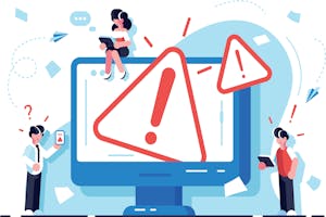
Once your homepage has passed the 50-millisecond test, your website must compel users to dig further into your available tours and activities. Perhaps surprisingly, the decision to navigate to interior pages on your website or to learn more isn’t based solely on your offerings, but rather on your website’s design.
According to SEWOR, 38% of people stop engaging with a website if the content or layout is unattractive.
Common elements that turn people away are:
While redesigning your homepage can feel like a big undertaking, it has the ability to have a significant impact on keeping users on your website. Take some time to make sure the homepage is clean and simple – offering users the most important information first and bringing them into the conversion flow without overwhelming them with choices. Select just a few high-quality images that reflect your offerings and stir the right emotion in users. You can learn more about how to improve your homepage in our guide to creating a highly converting home page.
As a tour operator, the main goal of your website is to drive bookings. If you don’t have a call to action (CTA) front and center on your homepage, it’s going to be difficult to achieve that goal.
However, 70% of small business websites don’t have a CTA on their homepage, thereby missing a huge opportunity to convert users.
This is a quick and easy solution that will make a big difference on your homepage. Add a CTA button with text such as “Book Now“ or “Browse Tours“ to your homepage to drive users who know what they want into the booking flow. You can learn more about CTA strategy on our guide to using CTAs to drive bookings.
 Pro tip: Make your CTA stand out by using a bright color that aligns with your brand colors, and place it above the fold – that is, towards the upper half of the web page where it is immediately visible without scrolling down the page.

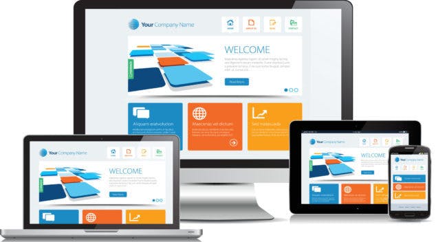
As we all know by now, the majority of web searches and online purchases happen on mobile devices. This means that it’s absolutely necessary for your website to display well on mobile.
85% of users say that a company’s website should be just as good or better than the desktop version when viewed on mobile.
No one wants to spend time trying to pinch and zoom on their mobile devices to find the content they need. If your website doesn’t have a responsive design that adapts to the size of the screen, users are likely to bounce off and find a competitor.
If you’re not sure whether your website has a responsive design, pull it up on a mobile device right now. What’s the experience like? Is everything sized appropriately for your screen? If the answer is no, work with your web developer to update your website to a responsive design.
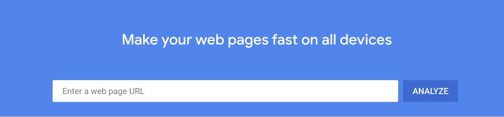
Our reliance on quick information at our fingertips has made us impatient, and 39% of people say they will stop engaging with a website if images take too long to load. Additionally, 47% of users expect a website to load in 2 seconds on average. If your website takes too long to load, it will inevitably turn users away, and you won’t get the chance to show them why they should book with you.
Start by checking your site speed. This will give you a report on your current site speed and elements you can improve to help your site load faster. Some of the most common solutions include:
Once your design and layout have invited the user to continue exploring your website, you can expect that someone will spend an average of 5.59 seconds looking at your website’s content. Once again, this is a brief window, so if they encounter irrelevant information or poorly written content that is full of errors, users won’t spend any more time reading or moving towards making a booking.
Make your 5.59 seconds count by drawing readers in with high-quality information that highlights the reason they landed on your website initially. Focus on telling them about the kind of experience they’ll have with your business and why they should book with you. You can find some tips on our checklist for writing high-quality content.
Pro tip: Put together a high-converting ‘About Us’ page where you address common questions that come up on your tours and share stories that personalize your business – these pieces of information are the kinds that nudge travelers towards making that booking!
 When given 15 minutes to consume content, two-thirds of users say they’d rather read something nicely designed rather than something plain.
A big block of text on a white page is not enough to keep users interested, even if the information is well-written.
Create a visually pleasing page by breaking up your content with high-quality images and appealing design elements. This could include using pull quotes or call-out boxes to highlight important information, using infographics to display data, compiling images in a slideshow, and other creative ways of displaying content.
By improving these elements of your website, you can set yourself up for success by drawing in users who land on your website. Additionally, stay on top of website trends to ensure you’re always providing your users with a positive experience, which will ultimately lead to better conversions. For more on this topic, check out our guide to optimizing your website for last-minute bookings, or explore our list of Google’s top free website and SEO tools.