- 10 minute read
- SEO
- Websites
Beginner,
Intermediate
Get a behind-the-scenes-look into FareHarbor's 2024 season

When a potential customer finds your company on Google, they will most likely land on your homepage first. Once they click on your company in the SERP (search engine results page) and your homepage starts to load, their user experience begins.
This is a critical moment to make a good first impression and convert that potential customer into a booker. Keep reading to learn the elements and best practices needed to make a good first impression on your homepage.
The first step to creating a great homepage that engages customers is to ask yourself how easy is it to understand the goal of your homepage?
The goal of your homepage should be clearly defined in the first section of the page, commonly referred to as the “Hero Unit” – the large, prominently placed banner image at the top of the web page that houses important information. Hero Units can be static images, videos, or carousels of rotating images featuring different CTAs, depending on your preference and website goals.
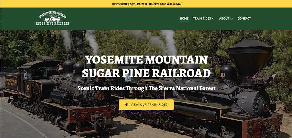
Think about what information a potential customer needs to know in order to decide whether your services fit their needs – the hero unit should clearly display:
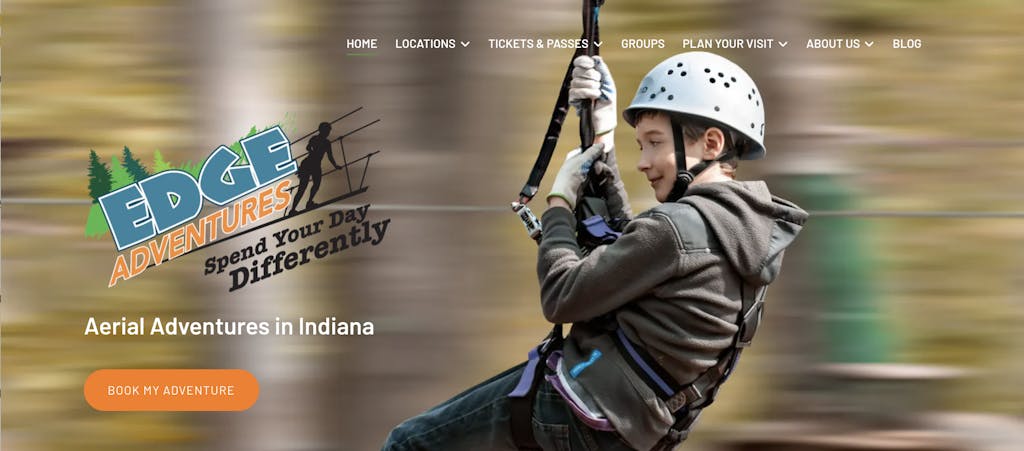
Critically important to include in a Hero Unit is a colorful button containing a call to action (CTA) that leads to a page or Lightframe of bookable activities. A successful CTA drives users to the ultimate goal of your website: More bookings!

 Pro tip: Keep things simple. Focus on one call to action. Multiple CTAs lead to decision fatigue, frustration, and ultimately users leaving your site.
Below the Hero Unit, feature your top-selling activities. You have limited time to capture someone’s attention so you always want to reduce scroll time as well as the number of clicks – extra steps – it takes for a customer to make a booking.
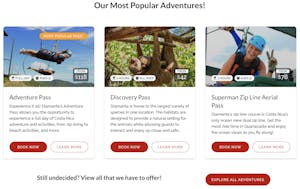
 Pro tip: Generate a FareHarbor booking report to find your most popular activities. If available, look at a year’s worth of data to account for your business’ seasonality. Based on your report, order and feature your activities appropriately on your homepage.
If you have a larger site with multiple categories, organize your website to do the decision-making heavy lifting for your customers.
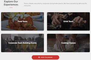
Headlines guide your customers through your website and engage them to book. Use headlines and subheadings to articulate how to navigate your site to make a booking. Incorporate keywords for SEO and showcase why your company provides the best experience.


Connect with your potential customers and provide context into the experiences you offer by sharing additional information about your company’s history. A brief origin story – including your company’s accomplishments, mission, goals, or anything else that is unique to your business – goes a long way to show potential customers why they should book with you. Keep this section brief and include a link or button to your About Us page, where users can learn more about your company.
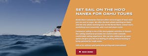
Once potential customers learn more about what you offer and who you are, it is imperative to support that content with social proof. Hearing from others who have had a positive experience with your company confirms that your business is trustworthy, established, and offers quality experiences. If you don’t have any reviews, don’t worry; we’ve got you covered. Watch this Compass video on reputation management to get started.
Social proof comes in many forms, including reviews, partner logos, awards, and high-quality images of clients on your tours. Potential customers are more likely to convert on your landing page if they can see that others have taken your tours and have been happy with the results. Social proof is a fast and effective way to build credibility with your prospects.

In the tours and activity industry, the majority of your customers access your site through their phones while they’re traveling, making it essential to constantly review your site on mobile. Reduce the number and types of adjustments required to transition from desktop to mobile by selecting a scalable and responsive design/template. WordPress, Wix, Weebly, and Squarespace all have responsive theme options – check out our website platform overview to help decide what platform is best for you.
Make sure you strategically order/place your content to limit the amount of scrolling potential customers have to do to find what they need and allow them to book in as a few clicks as possible. Remember to always keep the goal of your site – bookings – as the top priority when reviewing your site on mobile.
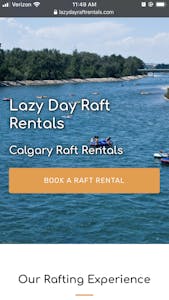
Homepages should load fast and direct the user to book with a minimal amount of clicks and scrolling while providing enough information to confidently book. If this balance is met, you’ll be well on your way to converting your potential customers into bookers.
Resist the temptation to overload your homepage with content and widgets. Save larger widgets and embeds for pages with less traffic. Save the longer content about your company for your About Us page to keep your users’ attention on booking your tours when they’re on the homepage.
If you keep your homepage clear, simple, and fast, you’ll be making a first impression that leads to more bookings. For more user experience tips, head over to our website guides.