- 4 minute read
- Dashboard & FareHarbor
- Industry Insights
Dashboard Quick Tip: 2 Features to Increase Sales at Checkout
All Skill Levels
Get a behind-the-scenes-look into FareHarbor's 2024 season

If you’re part of a business that offers many different tours and activities, this one’s for you!
Having many offerings without any organization on your website can cause your customers to get lost in their booking process, which could lead to fewer reservations. Luckily, on your Dashboard, you have the option to create booking flows to rectify this issue.
This guide will cover what booking flows are as well as some tips to maximize your conversions with this feature.
Please note, we recommend reaching out to Support to set up or edit your booking flows to ensure everything is set up properly.
Booking flows allow you to organize your items (tours and activities) into categories or groups which helps your customers better navigate your offerings.
For example, you could categorize your items into “Multi-Day Tours” or “Summer Activities” to make it easier for customers to quickly find what they are looking for.

Breadcrumbs at the top of the booking process
The best way to display your full array of activities is by breaking them down into categories within the booking flow. You have a few options on how to do this. Categories can be organized in the following ways:
 Pro Tip: Think of your categories like folders you save your files in. You can have multiple smaller folders within the main folder, which helps categorize things neatly.
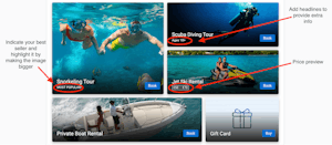
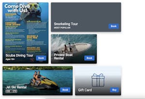
You can increase bookings of certain offerings by making your booking flows more aesthetically pleasing. All booking flow ‘cells’ can be adjusted by size. A cell represents an individual item.
As a rule of thumb, you would want your more popular tours to be a larger size than the others since these items bring you more revenue. On the other hand, you could also make your newer items larger to better market them to your customers. Whichever item(s) you want to promote more heavily should be emphasized in your booking flow.
To learn how to manage your booking flows, refer to these Help Pages.
Follow along with these guidelines to optimize your booking flows.


 Pro Tip: Try to identify your bestsellers and highlight them. If you are not sure what your bestsellers are, you can run a bookings report to see how many bookings you had per item in a chosen time period.
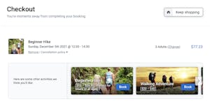
When you set up the Suggested Items feature in your Dashboard, additional offerings and add-ons will appear as customers check out. This will allow the customer to book multiple items at once under a single order.
This can boost your sales as the customer is possibly more inclined at checkout to select additional options. This feature works especially well in conjunction with retail items, where customers can purchase your merchandise as a souvenir.

For more detailed information on how to set up booking flows, please take a look at our Help Center article or reach out to FareHarbor Support with any further questions.