- 45 minutes
- Websites
All Skill Levels
Get a behind-the-scenes-look into FareHarbor's 2024 season
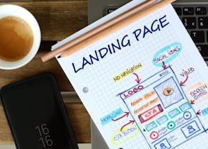
You’ve heard us say that your website is one of your best sales tools, and it certainly is. In a time where virtual communication is more important than ever your website is a window into your world. Once you’ve carefully crafted your website’s content and navigation and refined all technical components, what happens when you want to direct a viewer to something specific, rather than have them find it on their own? That’s where landing pages come in!
So, what exactly is a landing page? In short, a landing page is a standalone web page created to drive the conversion rates of your marketing campaigns. Landing pages help you apply the principle “less is more” to your campaigns, and create an effective way to capture a visitor’s attention. By driving people to a page that is specific to their needs (a landing page), you eliminate many of the potential distractions that your other pages on your website can create. They also streamline the buyer’s decision-making process to help drive higher conversion rates because they are focused on a single goal or call to action (CTA).
Landing pages contain straightforward information about a single product or action the business wants people to take (like signing up for email marketing), as well as a lead form that asks visitors for their contact information in exchange for something of value (like a promo code) or allows them to make a purchase.
Generally, you create a landing page to supplement your existing marketing campaigns – from social and paid search ads to retargeted ads, email marketing, and more. This guide offers an overview of the key elements to include when creating a landing page and design best practices and tips to follow when creating custom landing pages for promotion or advertising purposes.
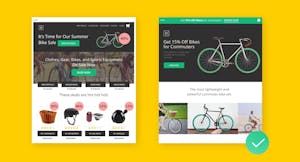
Landing pages should be clean, simple, and straightforward. A common error when it comes to creating a landing page is to try and include all of your website’s content and business information onto one page. Remember, landing pages focus on a singular purpose or goal – to get an email sign-up, or to sell a product or service – so the main elements should focus on the goal, and the information contained on the page will (and should) differ from what is found throughout the rest of your website.
Take for example the image above: on the left is a screenshot of a website homepage – it includes a variety of information on what can be found on the site, including deals on bikes, bike equipment, and the navigation menu. The landing page on the right differs in that it has a singular focus – it features a sale on commuter bikes. The sole purpose of the landing page is to promote a specific product and to increase sales; to that end, it doesn’t include any information that doesn’t support that goal.
This example highlights many of the primary elements to include when designing your own landing page:
When incorporating these elements, keep your singular campaign focus in mind to help inform your design decisions and follow the best practices below.
Although landing pages are often not navigable from your website’s main menu, it is important that landing page designs are consistent with your overall brand. Whether a customer has viewed an offer on social media, in an email, or on your website, their experience clicking through to a landing page should feel like seamless and cohesive.
Branding elements to consider include fonts, colors, and logos. Take a look at our Branding 101 guide for important elements and best practices to follow when it comes to developing your brand identity and use our Branding Checklist to keep track of your progress.
A high-quality image (or images) that illustrates your offer or service is a must-have. In the short time a visitor spends on your page, they should have a very clear picture of what you are offering and what they can expect. We recommend choosing photos of your customers enjoying your tour, activity, or attraction. That way, customers will know what type of tour you provide, and showing some happy faces serves to provide an emotional connection plus some subtle social proof.
Craft a strong headline that is clear and concise. In addition to your image, this is the first thing that customers see and read. Focus on the keywords that best apply to your business and a key Reason To Believe (RTB) that complements your business — simply put, why your customer should believe that your claims and promises are credible and trustworthy.
 Pro tip: Get creative with your RTB and let it guide the tone of your page. An RTB can highlight anything from your level of experience – “20+ years as a Coast Guard certified captain”, to your stellar reputation – “#1 tour in the area on Tripadvisor”.

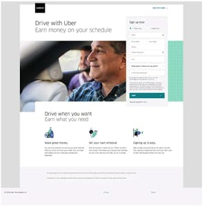 Copy should be compelling and include information pertinent to drive the conversion (without overwhelming readers). From a design perspective, it’s important to properly organize and structure your content so that it is digestible and quick-hitting. Use visuals to support your content and guide your audience’s eyes down the page around your content – think: icons like arrows, colored boxes, etc.
In this example, Uber has sectioned its content to keep their key points short and easy to read, using icons that help draw the eye across the page.
While your website and landing pages maintain your core brand colors, your on-page CTA is an opportunity to be disruptive with color. Consider using a complimentary color or shade that will stand out on the page. In addition, you can be a bit generous with the button or text size of your CTA — no need to go overboard; just ensure that it’s big enough to read easily. Also, keep your CTA concise while telling readers exactly what action you want them to take when they click the button. To learn more tips and tricks, we have an entire article dedicated to using CTAs to drive bookings.
Keep your lead form “above the fold”, meaning in a place on the page where users do not have to scroll down the page to find it. If possible, an even better option is to have the form scroll with the user as they move down the page.
 Pro tip: Keep your forms short and sweet. Focus only on collecting the essentials like contact information (to join an email list) or payment options (to make a purchase), so viewers don’t get discouraged by endless fields to fill out and abandon the form or page.
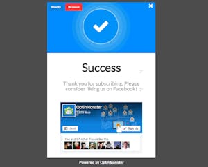 Thank you pages are important not only to the customer experience but also for internal tracking. A thank you page serves as both a confirmation of submission or transaction and an opportunity to keep your visitors excited about their upcoming tour. This page will mainly contain the following:
Keep your layout and design minimalist and clean, with plenty of white space to help CTAs and other visuals pop. Check your design on mobile, desktop, and tablet to ensure that headings, paragraphs, and graphics all align. It’s also a good idea to check how your layout is displayed at different resolutions to make sure that everyone can see your heading and CTA without scrolling.
Now that you understand the basic elements and design guidelines for landing pages, it’s time to get creative! Start by identifying a single goal, such as driving bookings for a specific tour or activity, and work your way through the list of elements to include in this guide. Like all things in digital marketing, there is room to test and learn, so don’t be afraid to A/B test several elements and designs to see what works best.