- 17 minute read
- SEO
- Websites
Beginner,
Intermediate
Get a behind-the-scenes-look into FareHarbor's 2024 season

Your company’s website should have two main goals: to make your business and activities discoverable in search engines and to convert visitors into customers. Optimizing your website helps you achieve these goals by giving your site the best chance of ranking in search results, making your site easy to navigate, and providing potential customers with a logical booking path from your homepage to booking an activity.
One of the most important components of optimizing your website is on-page SEO, which is essentially everything you do to communicate to Google what each page is about. This is done in part through the use of keywords in strategic places, such as in headings and metadata. Other factors that increase conversions include great content, an easy path to conversion, high-quality images, and a good user experience.
Keep these eight elements in mind when optimizing your website to help it rank and convert.
More and more online transactions are happening on mobile, especially in the travel and tourism industry. Travelers often use their phones or tablets to search for things to do in the city they’re visiting, and these mobile searches lead to business for local companies. According to Nectafy, 88% of searches for local businesses on a mobile device result in a call or a visit to the business within 24 hours.

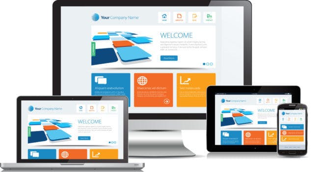
Because many of your customers are looking at your site on mobile, it’s important to make sure that it looks great and works as intended no matter the size of the screen. This is where responsive design comes in. Responsive design means that your pages resize intuitively depending on the device they’re viewed on, whether that’s a desktop, tablet, or phone.
Responsive design uses flexible grids and layouts that respond to the device being used and resize the elements of your site proportionately. The best way to check if your site is responsive is to pull it up on your phone. What’s the page load time like? How do the images look? How much scrolling do you have to do to get to a book button? Is the text easily readable without pinching and zooming?
 Pro tip: If you have to pinch and squeeze to read the text or scroll from side to side to see the entire page, your website is not responsive!
If you’re not happy with the responsiveness of your site, work with your web designer to better optimize your page for mobile. This might mean resizing images, cutting down on text, hiding certain elements of the page on mobile, or other tactics.
The title tag is the HTML element that specifies the title of a page, and it’s the headline for the listing in the SERP (search engine results page). It’s important for this element to be optimized because it can increase click-through rate, which in turn can increase your search engine ranking. It’s also the first impression searchers get of your site, and you want it to match their search intent and give them the information they need to click through to your site.

 Pro tip: Don’t overdo it on the keywords! Focus on your primary keywords for that page.
![]()
![]()
Meta descriptions are brief summaries of what a page is about that appear in the SERP. While they don’t influence search engine rankings, meta descriptions play a big role in helping click-through rates by telling searchers what a page is about, incorporating keywords, and enticing clicks.

Book now! Reserve today. Learn more. Book before it sells out!
 4. Alt Text
Alternative text is an HTML attribute that uses a word or phrase to describe each image on your site. This is incredibly important for accessibility on your site. When visually impaired visitors are browsing your site, alt text allows them to understand the content and nature of your images. This is also the text that is displayed if your image can’t be loaded. As a bonus, this is one additional place when you can insert relevant keywords.
 Pro-tip: You don’t need to include words like “image of” or “picture of.” Use your characters wisely!
The H1 is the first heading on your page, describing the topic of the page for readers and for search engines. The H1 is one of the most important ranking factors, helping search engines understand what the page is about. There should only be one H1 per page.
On your homepage, the H1 should always be the name of your company. On activity pages, it should be the name of the activity. On other pages, the H1 can vary. Just make sure it describes the content of the page.

To engage users, build trust, and convert them into customers, it’s important for your site to have a consistent and logical structure, an easy-to-follow conversion flow, and be built with the user’s experience in mind.
You want all the most important pages on your site to be easily accessible. To accomplish this, make sure your site structure is logical and well-balanced. The structure should have somewhere between two and seven main categories, all listed on the menu at the top of the site, with the subcategories nested underneath. Don’t hide any important pages (namely pages where customers can book) deep into the menu structure. Make it easy for customers to find the information they need to book!
User experience, a.k.a. UX, relates to the way in which a user interacts with and responds to a website. Users want to be able to navigate your site instinctively, finding things exactly where they expect them to be (for example, they’ll expect to find your contact information in the footer). By keeping your user in mind when organizing your site, you can also help rankings. Search engines like sites that have good UX because they keep users on the site longer.
Ideally, you want your visitors to land on your homepage, visit your all activities page and browse your offerings, click on the activity they’re interested in, and book. Create a clear path that takes your users easily from one page to the next by using buttons and CTAs.
When customers land on your homepage, give them the option to get right to your offerings with a button that has a CTA like “Browse All Activities.” For example, on FareHarbor’s website, you’ll see a “Get a Demo” button featured prominently on the homepage. You don’t want your customers to spend too much time trying to figure out how to book, or they’ll eventually give up and go back to their search. A clear flow is crucial to keeping visitors on your site and leading them to the ultimate goal – making a booking.

Engaging content is the lifeblood of any website and an important part of the user experience. The copy on your website should be honest, have a clear structure, cover all relevant details, and be free of errors. To optimize your content, follow these simple tips:
Want to learn more about content? Check out our guide on creating content that your customers, and Google, want or learn more about keyword do’s & don’ts!
Using high-quality images that represent your brand and visualize the experiences you offer helps to build trust and increase conversions. To ensure that your images look great on any screen, make sure to follow the following size guidelines:

It’s always best to use images that show people enjoying your tours or activities. This gives potential customers a better idea of what your tours or activities entail, and it gets them excited to have as much fun as the people in your photos! If you don’t have access to high-quality photos of your tours, try searching for high-quality stock images that depict your general location or activities.
 Pro tip: Make sure the content of your image has plenty of space on the top and bottom. Images are often cropped to accommodate different screen sizes, and you want the main content to be visible no matter what.
The world of website optimization and SEO is constantly evolving. As Google learns what users want, they often make small adjustments to their algorithm (read our Google algorithm guide for more on this!). This means that your website can’t remain stagnant. It’s important to audit the elements listed in this guide to make sure they continue to perform. Using tools like Google Analytics, you can keep track of which pages are getting traffic and which aren’t and make changes accordingly, like updating the title tag, H1, etc.
There are many elements to a successful site, and they’re not all listed in this guide. Use this as a starting point, but stay up to date on what you can do to improve your site’s performance. We can’t guarantee that these changes will get you a top spot on the SERPs, but these best practices are a great place to start.
Ready to learn more about how to make your website stand out? Check out our other website guides!