- 11 minute read
- Business Management Tips
- SEO
- Websites
All Skill Levels
Get a behind-the-scenes-look into FareHarbor's 2024 season

The FareHarbor Lightframe – where online customers browse and complete their booking – offers many benefits to users. From the Lightframe users can see the entire booking process on a single page, and can complete a secure booking without leaving your website.
The Lightframe is highly user-friendly and is optimized for online sales, but your website’s SEO and user experience are boosted even further when you build separate activity pages for each tour with buttons that then open to the Lightframe.
Keep reading to understand how the Lightframe and activity pages go hand in hand to improve SEO and help users get a better idea of your offerings.
When an activity goes directly to Lightframe without having a dedicated activity page, it will look like this:
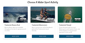
When users click “Book Now,” they are taken straight to the Lightframe.
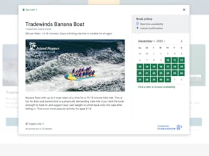
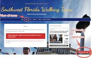
On the other hand, on a site that has activity pages, users can either click a book button, taking them straight to the Lightframe, or visit the individual activity pages to get more information.
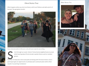
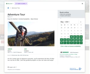
Within the FareHarbor Lightframe, your customers can read a description of the tour or activity, choose a date to book, and see additional information about pricing, age requirements, and more. However, getting users to click that “book now” button is much easier when you provide some context and give them a description of the tour or activity on an activity page. If they don’t have a good understanding of what you’re offering, they might hesitate to click the book button and open the Lightframe, and you could miss out on bookings.
Even if you’ve written an amazing tour description and included that content in the Lightframe, if the content is not on your website, it won’t get crawled and indexed by Google. Taking the time to create activity pages and fill them with relevant, high-quality content gives your site a better opportunity to rank for keywords.
For example, let’s say you’re a water sports tour operator who offers kayaking, jet-skiing, banana boat rides, and several other activities in Miami, Florida. Your homepage might rank for keywords like “Miami water sports” or “Miami tours.” By building out activity pages, you can target more specific keywords like “Miami jet ski tours,” “Miami kayak rentals,” and more.
 Pro tip: Writing unique content for each page gives you more chances to work those keywords in naturally and improve your position on the SERP.
Learn how to choose the best keywords for your business in this guide.
To make the most of your keyword strategy, it’s essential to write quality content. Not only does activity content provide more ways to use keywords, but it also tells guests what to expect during the activities you offer and serves as a way to sell the tour to its intended audience by painting a picture of the experience. Building excitement and anticipation for the tour within the content you write will make users more likely to complete a booking when they click that “Book Now” button.
Additionally, writing more content makes your site appear in more search queries and signals to Google that your site is trustworthy and helpful to users searching for specific information. To help your content go the extra mile, be sure to check out our guide to writing tour descriptions that will make users want to book!
Finally, creating activity pages improves user experience because it makes it easier for users to see all of the activities your business offers in one place. They can quickly jump from tour to tour, read the descriptions in detail, and determine which activity is right for them before clicking the book button.
If the user isn’t familiar with the FareHarbor Lightframe, which might be the case if they’ve never booked with you, they may not be aware that the activity description is in the Lightframe. Therefore, having the complete content right on the activity page helps the user avoid confusion.
Now that you have a clear understanding of how the Lightframe and activity pages work together to create a cohesive experience for users, let’s talk about the exception to the rule. Although it’s best practice to create activity pages, there are some cases when opening directly to the Lightframe is the best option for your site.
Now that you’re aware of the many benefits of creating activity pages, we’re sure you’re ready to get to work improving your website. Start by taking a look at our website guides for design tips and best practices.
Got questions about the FareHarbor Lightframe? Learn more in the Help Center.