- 45 minutes
- Websites
All Skill Levels
Get a behind-the-scenes-look into FareHarbor's 2024 season

Your ‘About Us’ page is one of your first chances to make a good impression on visitors to your website. Potential bookers read your About page to learn who you are, what matters to you, how you do what you do, and more — think of it as a quick glimpse into what makes your business tick and an opportunity to make a personal connection with a potential customer. The About page often serves as an entry page to your website, ranking well for brand-driven searches in the SERP, so it’s essential to treat it as your readers’ first interaction with your business. How will you make a good first impression, engage with customers, and draw their attention to other pages (such as activity pages) on your site?
A great About page can make all the difference when it comes to gaining new guests for your tours and activities. Making the most of your About page can lead to more bookings, a boost in brand engagement, and other benefits. In fact, it’s often a conversion trigger, since people tend to check the About page to learn more about the business before going ahead with their booking.
It can feel a bit awkward to sit down and write about yourself, but it’s one of the best ways to strike a chord with readers who want to know your values and what your business stands for. It’s long been understood in the marketing world that there is real ROI in creating likeability – so try to create a personal connection with your reader that goes above and beyond simply providing them with facts about your business.
Creating a quality About page also boosts your website’s E-A-T — Expertise, Authoritativeness, and Trust. E-A-T is just one of the ways in which Google’s quality raters determine the quality of a site – focusing on how much users can trust the authors and content of a website. A detailed About page is one way to improve your site’s E-A-T, telling readers who you are, showing off any awards, certifications, or media mentions, and making it clear that you are an expert in your field.
In this guide, we cover content and design elements that make up a winning About page and how you can create one for your tour and activity website, plus tips for making this important page work for your brand in the long term.
This part of your About page gives you a chance to capture the attention of your readers by hooking them with text that will make them want to keep reading to learn more about your business. It’s best practice to label the page “About” or “About Us” in your menu and metadata so that users know exactly what the page is about, but starting with a more unique headline that matches your brand tone will make people eager to read the rest of your content. If possible, think of ways to make your headline benefit-driven. While your About page focuses on you and your business, readers always like to know what they will get out of choosing an experience with you.

Rather than describing the services your business offers, use your About page to tell the story behind your business. How did you get started? What challenges did you face along the way? How has the business grown from its inception? Highlight accomplishments and major events in your company history, especially if you have a fun or interesting tale behind how you got started. Mention notable team members or partners who help make the business a success. Think of your About page content as a way to introduce potential guests to your amazing team. Don’t be afraid to make jokes, have some fun with the content, or otherwise inject your personality into the story. This humanizes your company and will help potential customers connect with your brand on a more personal level.
 Pro tip: Your entire About page should be written in the first person (e.g. “I” or “we”). Even if you have a marketing professional craft your content, it should always sound like it is coming directly from you to the reader.

Yes – in its most basic composition your About page is used to share information about your company – but in doing so make sure to keep your customer at the center of your mind. In the same way that your business blog shouldn’t be entirely self-promotional or me-me-me, your About page should show how well you understand your customer and their needs. How can your company help them? What are the pain points or questions that led them to your company? Why are you the right fit for them? Some estimates show that up to 73% of people care about the company, not just the service, when making a purchase (BBMG).
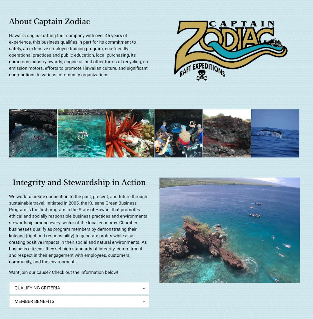
Storytelling is even more powerful with visual elements, so be sure to include some photos of your team, your beautiful location, your tours or activities, or even your company pet if you have one. Using photos helps people put a face to the name and allows them to form a connection with your team.
 Pro tip: Create a video introducing yourself and your team members for a quick way for viewers to get to know you.
75% of customers admit to making judgments on a company’s credibility based on the company’s website design (SWEOR) – let that sink in – 75%. The design of your homepage shouldn’t stray too far from the way the rest of your site looks, but should have it’s own look, feel, and personality. When designing your About page, use creative ways to keep people’s eyes moving throughout the page. This could mean breaking up the text with photos or graphics or even adding elements like a timeline of events in the history of your business, or a slideshow of notable moments. Use colors and fonts that match your branding. Learn more about how to incorporate branding on your About page in this guide.
A big part of your About page is showing potential customers why they should choose your business over your competition. One way to do this is to share credentials like degrees, certifications, awards, media mentions, and anything else you can think of that sets you above the rest and demonstrates that you are an expert in your field. These do not have to take up a huge amount of page real estate but can stand alone at the bottom of the page as icons/graphics to create visual interest. Depending on the page layout and other content you could also weave them into the text when telling your story.
Consider including a few testimonials on the About page that focus on customer interactions with you and your team. Look for reviews that mention how you or your employees made the experience worthwhile for a recent guest.
Now that readers have gotten to know your business, what is the next step you want them to take on your website? Providing a call to action (CTA) keeps users engaged with your site and prompts them to make a booking. You can include a CTA for users to check out your tours and activities, subscribe to your email newsletter, like/follow you on social media, or contact your business.
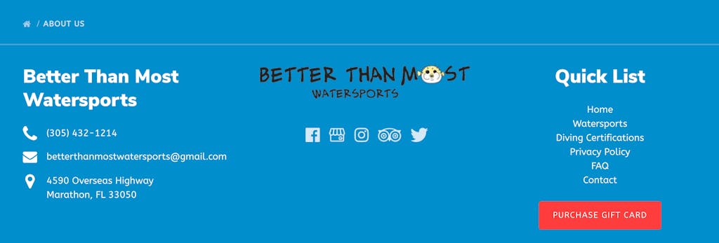
Make sure customers know how to reach you! Include your contact information and social media profiles as clickable icons so users have another platform to connect with you. One of the best ways to do this is to include important information in the footer of your website, so it is inherent to every page, and easy to find regardless of where a reader lands.

After creating and/or optimizing your About page, help it work for your brand in the long term by evaluating its effectiveness over time. Check your analytics for traffic volumes, visit duration, and bounce rate on the page, to name a few important metrics. You can even test two different versions of the About page through A/B testing to see which one performs better. Don’t be afraid to make small changes, such as using a different headline, adding a video, or shortening the copy based on what the data tells you. Finally, make sure the page is optimized for all devices, especially mobile, since the majority of your potential customers will access your site on their phones while traveling.
Interested in making further improvements to your website? Learn how to design a landing page, use schema markup, and even build your own website in our website guides section.