- Dashboard & FareHarbor
- Reputation Management
- Websites
From Clicks to Bookings: The Ultimate Conversion Playbook
All Skill Levels
Get a behind-the-scenes-look into FareHarbor's 2024 season

At FareHarbor, our #1 goal is to help you increase your conversion rate with everything from simple Dashboard adjustments to in-depth Compass guides or full-fledged strategy updates.
So we sat down with our Director of Account Management, Colin Daniel Quinn, to pick his brain on some of the top conversion tips he has seen work wonders for various operators.
Although there is no one-size-fits-all solution, there are countless ways to increase your conversion rate. See below for all three of Colin’s suggestions to help get the creative juices flowing on how you can drive bookings.
Far too often I see operators attempt to sell a large variety of different tours and products. However, when you look at the data, it almost always reveals that despite a business having 15 to 20 different offerings available, customers are only booking one to three different items.
While it might seem like having a larger selection of options caters to more customer preferences, it typically leads to a paradoxical effect known as choice overload. This is when bookers become overwhelmed by the plethora of options, and end up not making a booking at all.
It’s a lot like going to a restaurant with a novel for a menu. You sit down and immediately think, “There is no way the chefs in that kitchen know how to cook everything on this menu well!”
The same can be said for tours and activities. Instead of offering the booker many OKAY options, make them choose one of your EXCEPTIONAL experiences. Bottom line, stick to what you’re good at and give the people what they want.
According to Facebook, 86% of travelers who book on mobile agree that it’s important for booking to be as easy and convenient as possible.
And with a majority of bookers preferring to book on mobile — you should make sure your mobile user experience (UX) is streamlined, easy-to-navigate, and doesn’t include any unnecessary steps.
Thus, it is imperative not to neglect your mobile website or app design. Your mobile purchase path needs to be intuitive, clean, and responsive. Shoot for the fewest amount of clicks as possible!
My advice would be that you should first focus your efforts on your mobile UX and then dial-in the desktop UX.
 Pro Tip: Additionally (and very importantly!), make sure you have a fixed static book button throughout the mobile experience. This is a button that stays with the user as they scroll through your site or switch pages. This way, whenever your customer decides to book, the option is front and center and ready to be clicked.
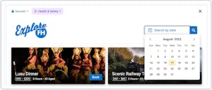
When you utilize the FareHarbor search by date (SBD) feature, your customers can navigate your availabilities far more efficiently. It gives your customers the convenience to quickly find and compare options that fit their schedule — which can reduce booking fatigue and encourage more reservations.

Our SBD integration displays real-time availability ensuring that the booker doesn’t have to play “availability roulette” and manually sift through various options hoping the tour they want to book has availability. “Availability roulette” often leads to user frustration and abandoned bookings.
By presenting customers with options that are only available during their chosen time frame, the SBD integration has a positive impact on conversions.
We hope you enjoyed hearing conversion tips directly from our very own Colin Daniel Quinn. See below for other ways you can improve your conversion rate!