- 5 minute read
- Local Strategies
- SEO
- Websites
Mobile-First Indexing is Here – Here’s What You Need to Know!
All Skill Levels
Join hundreds of other operators and REGISTER NOW for Spark 2024 New Orleans October 13-15th!


If you’ve read our introductory guide on the importance of mobile-first indexing you already know why it is a critical part of your website and online strategy. The next step is to thoroughly vet your own website to make sure all elements are optimized for a mobile experience. We’ve outlined the top 11 mobile-first design tips to make the process easy and painless. Read on!

Mobile version.
It’s always a good idea to heed Google’s advice on website best practices. The powerhouse search engine recommends implementing responsive design, which means that the content on a web page responds to the device it’s being viewed on and changes accordingly.
For example, when viewed on a smartphone, the content will adjust and rearrange to fit the smaller dimensions of the screen.
Desktop version.
Ask your web developer what they can do to implement responsive design and improve your website’s formatting on mobile. There are also many tools and templates you can use to implement responsive design, like Bootstrap and Webflow.
It is important to take some time and do a bit of research to see what option is right for your website.
We’ve all heard the saying “less is more”, and when it comes to mobile design it goes one step further because the less complicated, the better. This is in part because minimalist designs tend to utilize fewer files being added to the site, and fewer files means the site means a faster load time (we go into more detail on page speed below).
One easy way to implement minimalist design is to reorganize your site menu to include fewer options on mobile than displays on desktop. Many websites use what is called a “hamburger menu” (three stacked lines that sort of look like a stacked burger). The hamburger menu takes up less page real estate and still allows visitors to click to open and view the full menu.

Nobody wants to scroll all the way to the bottom of a long page to find the information they’re looking for. Position the most important information at the top of the web page so users know immediately what the page is all about. What is important information? Great question! They are things like:

Elements like ads and pop-ups for email lists or other signups can become extremely frustrating on mobile. Pop-ups and ads take up a lot of space on that small smartphone screen. They can make it difficult to scroll and even block important content that you want users to see. And we’ve all experienced the frustration of trying to tap the tiny ‘X’ in the corner to minimize the ad. Do your users a favor and ditch these annoying elements!
Smartphone users are used to fast results, and they expect your website to keep up. Your visitors won’t wait if your website takes too long to load. Fortunately, there are several ways to speed up your website load time, which we break down in this site speed guide. You can use a Google Lighthouse audit to see what’s slowing down your page load time and how you can improve your site speed.
Remember, the “Book Now” button is what gets users into the FareHarbor Lightframe and one step closer to booking a tour or activity. Clicking buttons with your finger is much harder than using a mouse (especially for those of us with big fingers!). Make sure the buttons on your mobile site are not only big enough to read the CTA, but also large enough for users to easily click it.
 Pro tip: Buttons placed toward the bottom of the screen are optimal for people clicking with their thumb, especially on oversized phones so they don’t have to stretch their thumb all the way to the top.
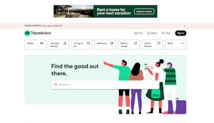
 7. Include a search feature.
Because the nature of mobile design often results in a pared down version of your site, adding a search feature offers a quick way for users to find exactly what they’re looking for. Put the search function in an obvious place so people can easily access it.
This may be a guide about designing for mobile, but some users actually want to view your site in the desktop version. Give them the option to switch to desktop view. When they’re able to browse your site in the way that’s most natural to them, they’ll feel more confident making a booking.
Remember, everything is smaller when viewed on a 5-inch phone screen. If the font size on your website is too small, users will have to zoom in to read the text, which detracts from a positive user experience.
Use standard fonts that are easy to read, up the font size, and test out different sizes to see what works best. Ask a few friends and family members to take a look at your site on their phones and get their opinion on the readability of your chosen font.
Some people like using autocorrect. For others, it’s a bit of a nuisance. When users are filling out forms on your website (e.g. contact, request private tour, etc.), autocorrect can make the process take much longer. For example, autocorrect often changes the spelling of people’s names and addresses. It might even prevent them from fully filling out the form, making you lose out on conversions.
Pro tip: Whether it’s a form to sign up for your email list or get a quote for a private charter, try to keep forms as short as possible so it doesn’t take too long to fill them out. Only ask for the absolutely essential information you need from the customer – like name and contact info. You can get the rest of the details later.
As with many website improvements, you can’t know how your site is performing without testing and analyzing the results. Regularly test your site on your smartphone to see if everything makes sense and is easy to use. Ask your friends, family and employees to do the same to get fresh perspectives on the mobile-friendliness of your site.
Optimizing your site for mobile increases conversions, improves your website’s visibility in search engines, and keeps your audience on your site longer. With the emergence of mobile-first indexing, now is the time to make your site as mobile-friendly as possible by following these tips.
Looking for more website best practices? Browse our website guides.