- 6 minute read
- Business Management Tips
- Dashboard & FareHarbor
6 FareHarbor Perks That Make Running Your Tour Business Easier
All Skill Levels
Get a behind-the-scenes-look into FareHarbor's 2024 season

In business, time is money, and one way to save time is to become more efficient and independent in your use of the FareHarbor dashboard. No matter the size of your company, operation, or team, the clicks and seconds you can save on a daily basis by learning some dashboard shortcuts add up rapidly and exponentially. We want every client and user to feel confident and empowered to run their business on FareHarbor with efficiency and ease.
This guide will cover great Bookings Calendar features that every FareHarbor company and user should learn how to utilize and leverage.
Making bookings, managing bookings, and searching for bookings are the main actions that the average user churns through day in and day out. Especially when you hit your peak season, every moment is precious, and a delay when taking a customer booking over the phone or by having a customer wait in long line could result in an unsatisfied customer or even worse, a lost customer.
Whether you are in your first week on FareHarbor or you’ve been using the platform for years, there are numerous ways to improve how you use the Bookings Calendar. For efficiency’s sake, we have narrowed it down to three of the most indispensable tools.
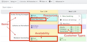
The FareHarbor dashboard has its own language, a set of terms that are unique and important to navigating and communicating about the setup. If you’re not familiar with the language, it’s going to be tough to decipher how to make bookings or make changes. It can also make it more difficult to ask questions or request changes from our wonderful Support Team members.
Using the right terminology can reduce a 20-minute phone call to just 5 minutes. Instead of sending a string of numerous emails back and forth, you can easily write one concise and clear email that contains all necessary information. It truly can’t be overstated how helpful it is to take just a little bit of time to learn key terms for the dashboard calendar.
One great resource is our FareHarbor Glossary. Use your browser’s find feature to look up a specific word, or just peruse through the list and see what catches your eye. For the calendar specifically, it’s good to know these terms:

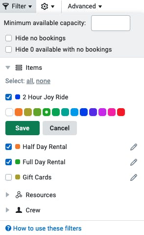
 Who doesn’t like color coding and faster load times? Customization can do everything from saving time to making viewing easier. This may be one of the most overlooked features of the dashboard, and it can make a huge difference in both organization and conversion.
For example, say your company offers boat and kayak rentals, and you have availabilities every 30 minutes for 8 hours of the day. That’s going to add up to a boatload (pun intended) of availabilities. If you try to use the month view for your calendar, it’ll be a disaster in terms of navigation and loading speed.
Let’s break down exactly what you can do to customize and optimize your bookings calendars.
As you’ve probably already noticed, here at FareHarbor we are obsessed with conversion—turning your prospective customers into paying customers. And one of the many ways to do that is to make customers’ decisions easier. If an online shopper is looking at a month full of activity times every day of the week and there’s no distinguishing factor, they may have trouble deciding whether to book a weekday or weekend, or whether to avoid a holiday or choose a holiday. Decision fatigue can start to set in. But if they can quickly see a headline that draws their attention and captures their interest, they have fewer decisions to make.
Special Valentine’s Day Package!
New Year’s Fireworks Cruise!
Weekday Special Prices!
These are all headlines you could put on your availabilities to call out specials or promotions. If people get to your booking calendar and you don’t have a headline calling out a weekday special or a special event for Mother’s day, they’ll never know to look for it.

Check out this help page to learn how to add headlines to one or multiple availabilities.
Did you know you can create private headlines? These are headlines on availabilities that can only be seen by your internal staff when they are logged in to the dashboard. Clients take advantage of these private headlines in a multitude of ways. For example:
Communication is key to efficient teams and happy customers, and adding concise information in certain strategic places will go a long way for your operation.
Please keep in mind that with many of these features and tips, only certain users will be able to make changes depending on their permission level. If you ever find that you or one of your staff can’t do something you need them to be able to do, let us know and we can make it right! In addition, every dashboard, every company, and every calendar view is different, so note that your particular situation may require more detailed attention. If that’s the case, just set up a training or a call with our team!
For more dashboard tips, head over to our webinars.